Choosing Your Brand Colour Palette (Made Simple)

When people think of branding, the first thing that comes to mind is often colour. While a brand is much more than simply your visual identity, colour is one of the easiest places to start—especially if you’re launching a new business or personal brand and need a professional foundation to build from.
Note: This article isn’t a deep dive into advanced brand identity. Think of this as a practical entry point: a way to spark ideas about what your branding colors say about you, and a toolkit you can use to build a functional palette right away.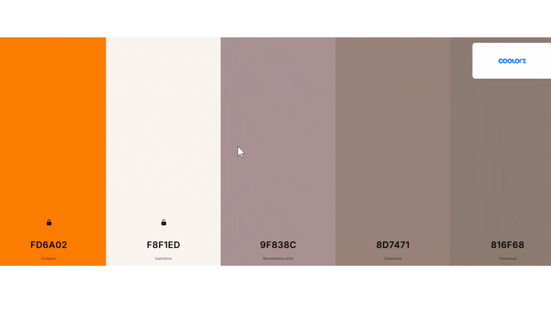
Why Colour Symbolism Matters in Branding
Think of colour through the lens of symbolism. Across cultures, humans have always attached meaning to colour:
-
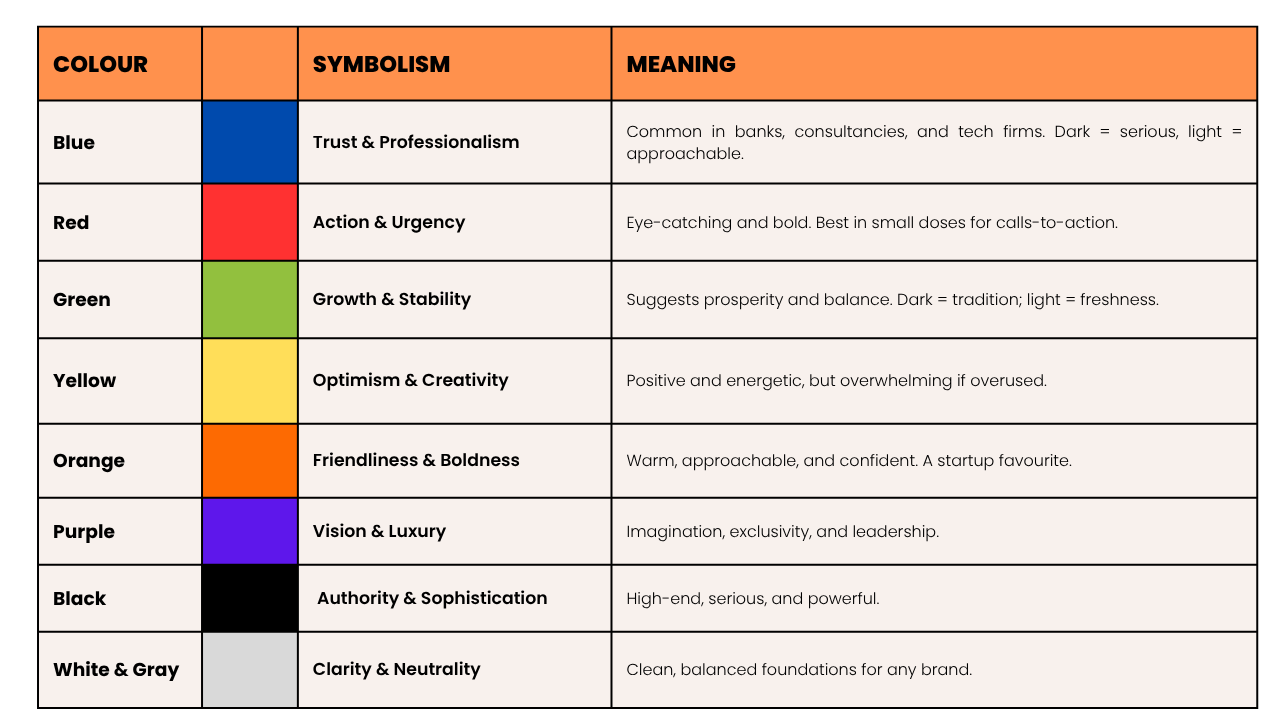
In Western societies, red often signals urgency or danger.
-
While in China, red represents good fortune and prosperity.
The same principles of symbolism apply to your brand. Colour associations shape how your business is experienced. For example: Purple can suggest luxury and vision while Orange feels friendly and bold.
At this early stage of your branding journey, your goal shouldn't be perfection, it should be simply making an educated decision to allow you to progress. Choosing colours that align with who you are and how you want to be seen gives you that simple foundation. From there, you and your brand can (and will) evolve.
Colour Symbolism at a Glance
Think Beyond the Logo
Most people will naturally start with their logo colours, but branding extends beyond that and to save time later it's important to contextualise what you'll need now. Eventually, you’ll need colours for:
-
Website backgrounds and call-to-action buttons
-
PDF documents, e-books, and presentations
-
Social media graphics and marketing templates
-
Social media graphics
That’s why it’s worth building a complete visual identity early by breaking your palette into three parts:
-
Primary Colours: 1–2 dominant shades for your core identity.
-
Neutrals: Light greys, whites, or off-whites for backgrounds and text readability.
-
Accents: 1–2 high-contrast colour for highlights, links, and emphasis.

A Simple Brand Colour Palette Generator Process
To build your palette quickly, use this step-by-step workflow:
-
Pick your primary colour(s): Start with 1–2 that reflect your core brand personality.
-
Add neutrals: Select soft, light tones that work well under black text, and darker tones to support white text.
-
Choose an accent colour: Find a contrasting pop of color for buttons or bullet points that need immediate attention.
The Tool Workflow (Coolors to Canva)
To simplify this, you can use a free brand colour palette generator like Coolors
-
Input the hex codes of your core colors and click the "lock" icon.
-
Hit the spacebar, and the tool will automatically generate a complementary palette complete with contextual neutrals.
-
Once you’re happy with the hex codes, upload them into a design platform like Canva. Saving them into your digital brand kit removes the guesswork every time you create a new asset.
Personal Branding Within a Corporate Structure
If you’re building a personal brand alongside an existing company role, you don't need to reinvent the wheel—you just need to find your space within it.
A tool like Coolors is ideal here. Input the hex codes of your company colours and experiment with complementary palettes. This lets you:
-
Stay consistent with your company’s identity
-
Add personal touches that reflect your own style
-
Create assets that feel authentic to you while still aligned with your organisation
The key here is transparency. Share your thinking with managers. Explain how your personal branding colour palette complements the company brand while giving you a distinct presence. This isn’t about going rogue—it’s about being additive to the company's overall story.
Branding Will Evolve
our first palette isn’t permanent. Think of it as a launchpad—a way to simplify early decisions and start creating assets without overthinking.
As your business grows, your identity will naturally refine. The reality is that companies rarely scrap their brand entirely; they simply give it a facelift when the time is right. Don’t wait for perfect. Pick your colours, put them to work, and let your brand grow alongside you.
Frequently Asked Questions
How many colours should a brand palette have?
A standard brand palette should have 4 to 6 colours. This includes 1–2 primary colours, 1–2 neutrals (for backgrounds and text readability), and 1 distinct accent colour for calls-to-action.
What are hex codes in design?
A hex code is a six-digit alphanumeric code (e.g., #FFFFFF for white) used in digital design to identify exact colour shades. Using exact hex codes ensures your branding remains consistent across your website, social media, and print materials.
Where should my branding go after choosing colours?
Colour is just your first step into brand identity. Over time, you will want to layer on additional elements, including:
-
Typography: Selecting consistent fonts that reflect your tone.
-
Imagery Style: Setting guidelines for photography and graphics.
-
Voice and Tone: Defining how your brand "sounds" in written copy.
-
Positioning: Crafting the unique story that differentiates you in the market.
ABOUT US
B2B MARKETING COMMUNICATIONS CONSULTANTS
We work with businesses from cyber security to technology integrators translating complex expertise into systems that capture attention and drive growth.